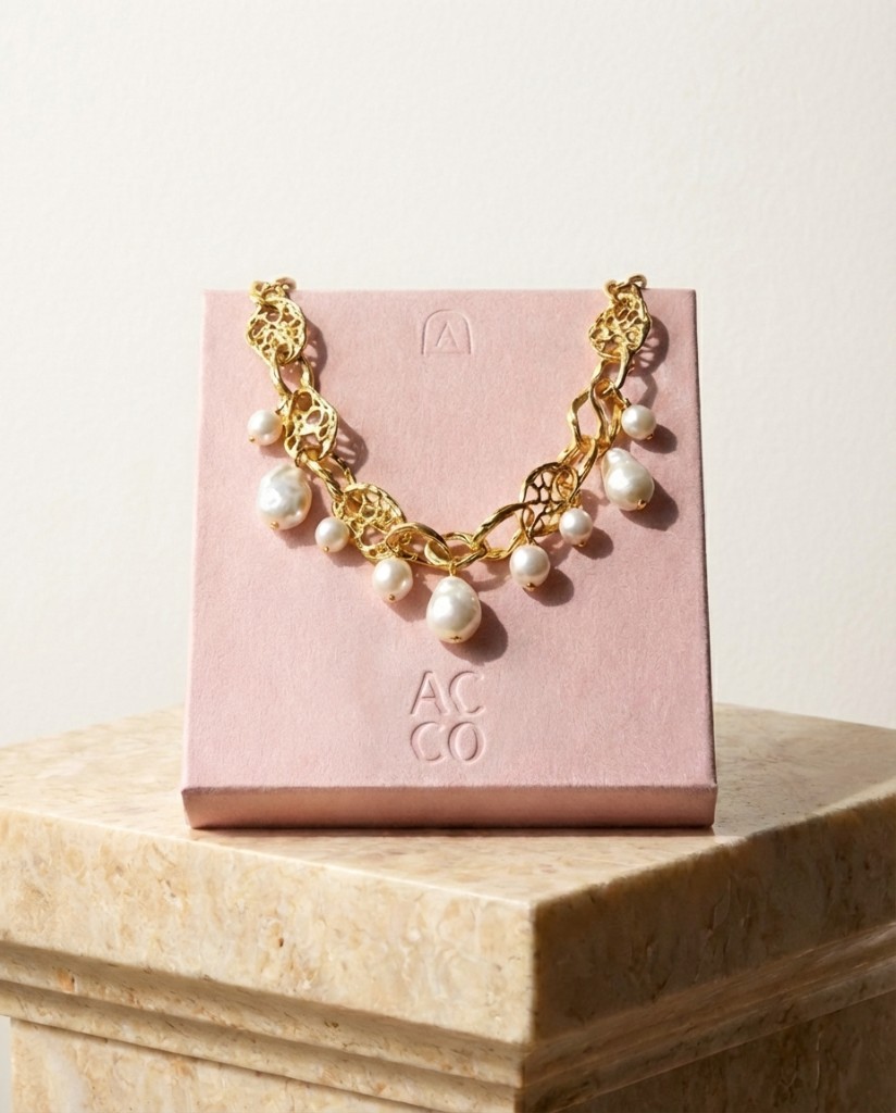
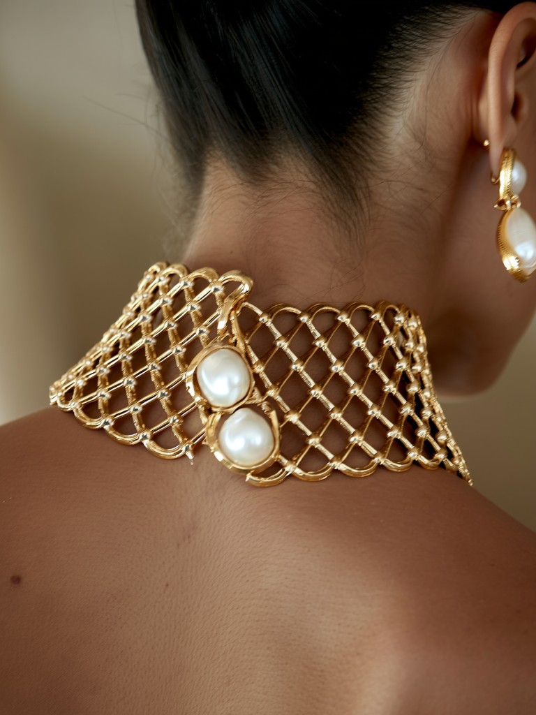
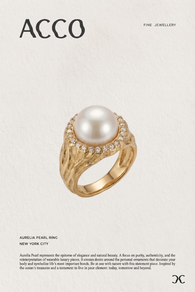
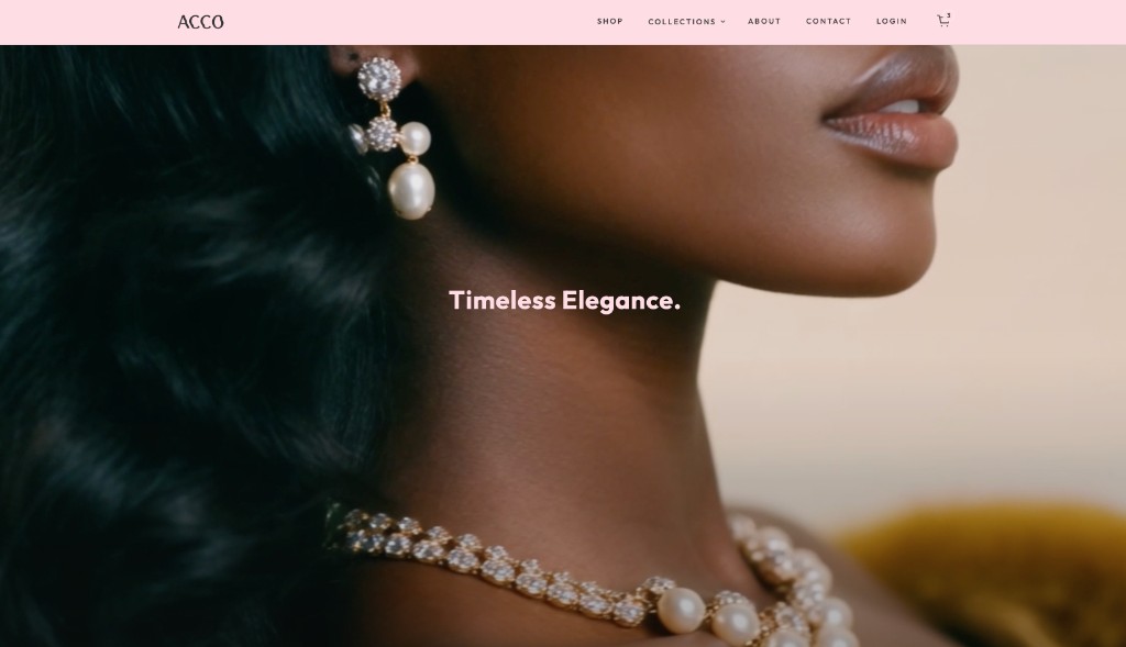
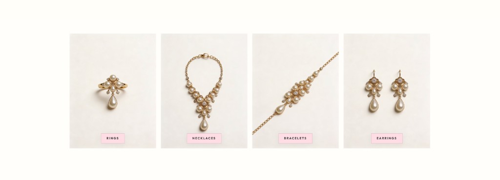
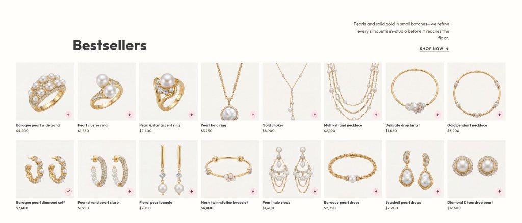
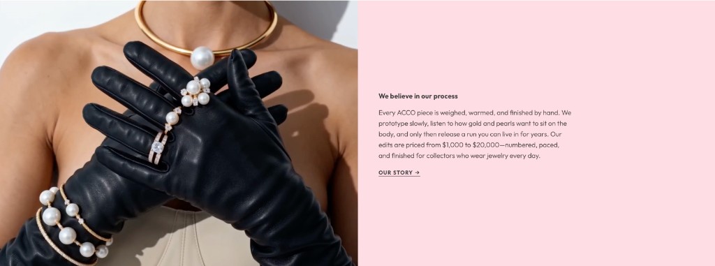
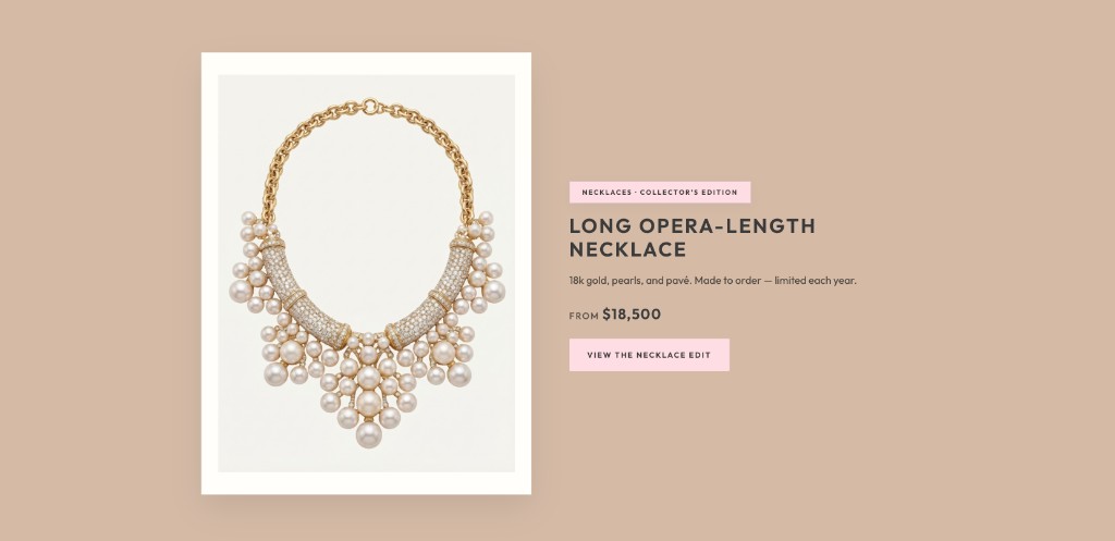
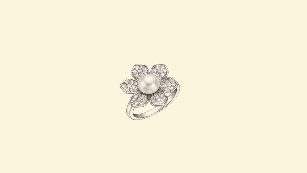
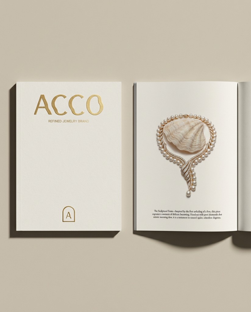
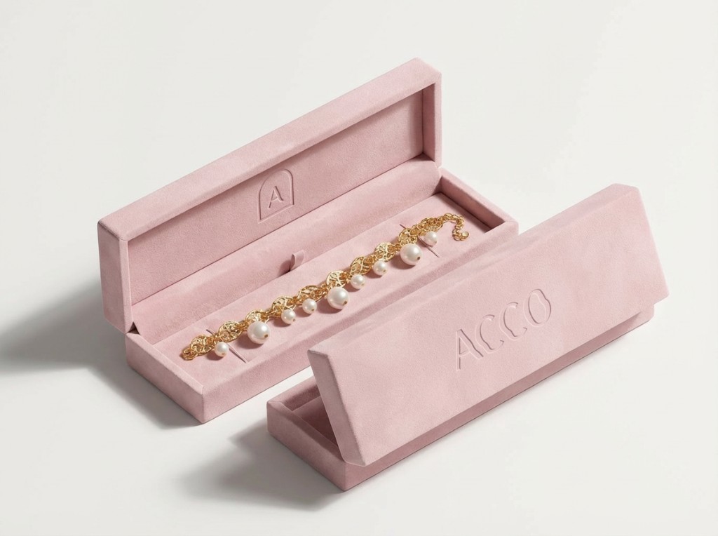
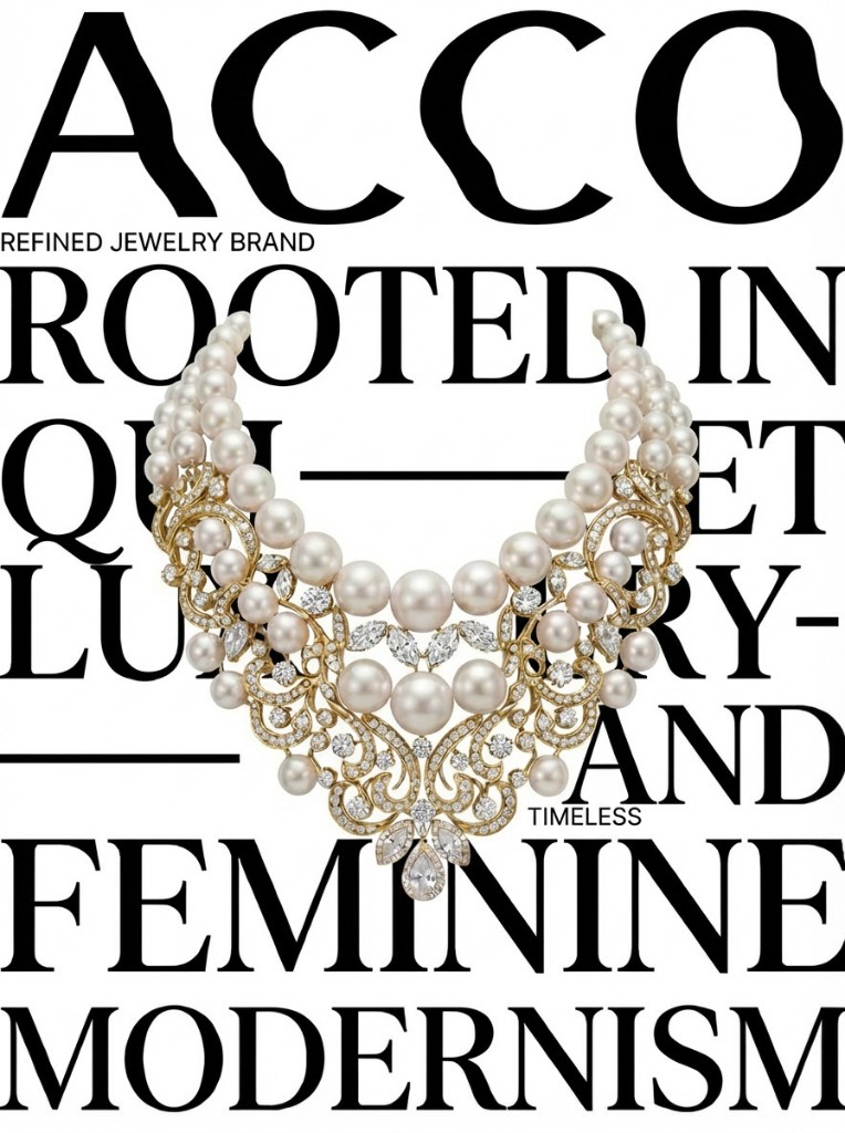
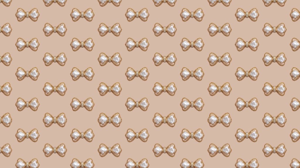
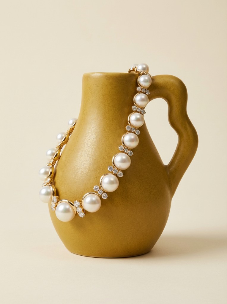
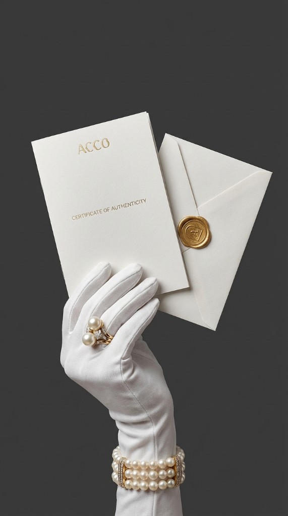
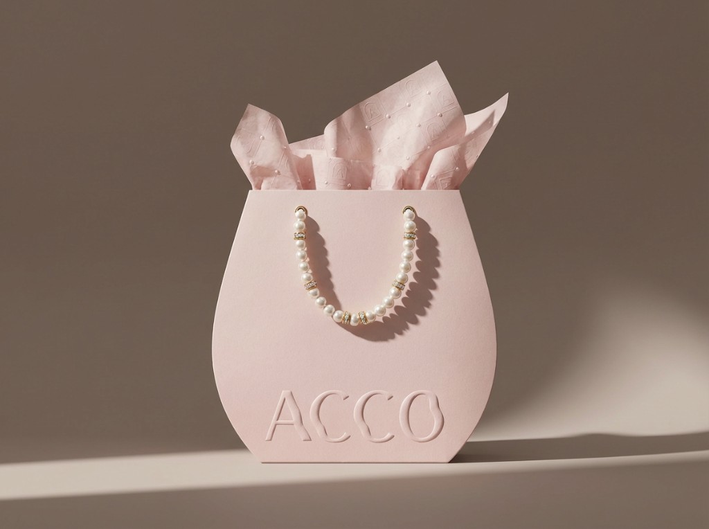
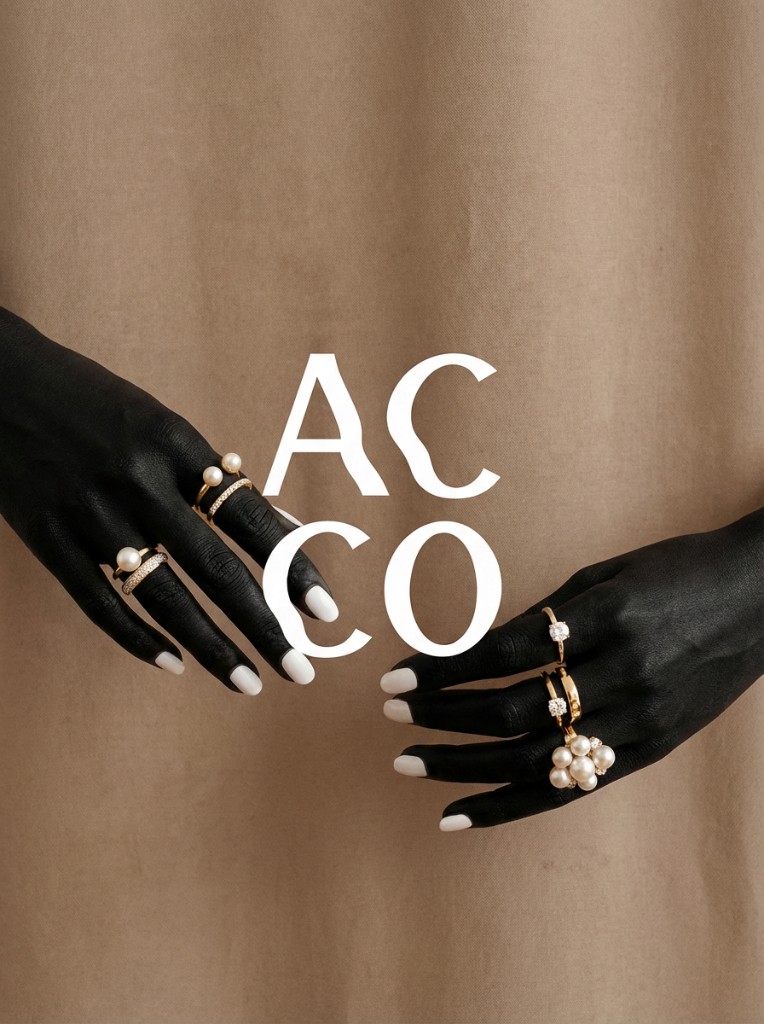
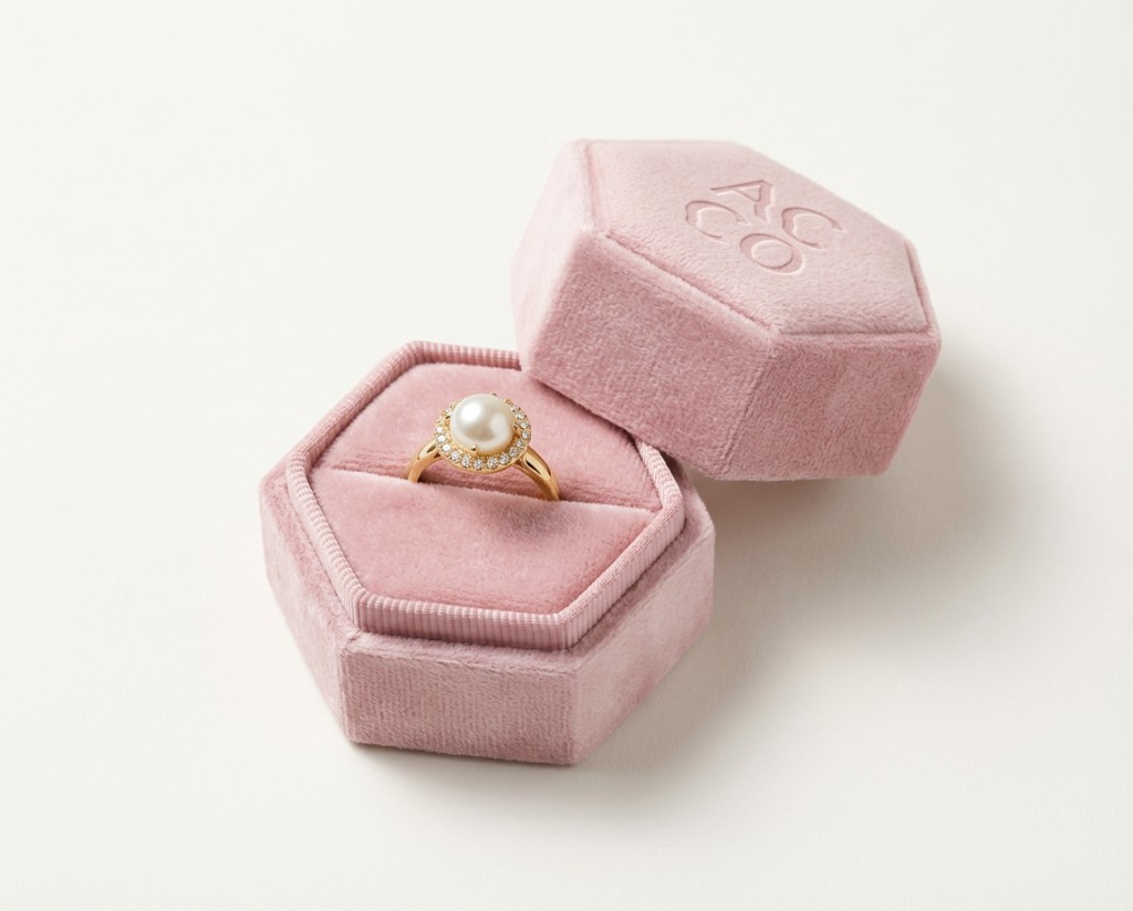
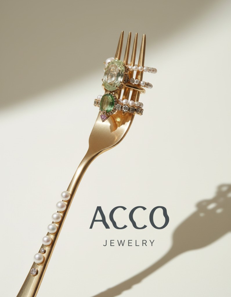
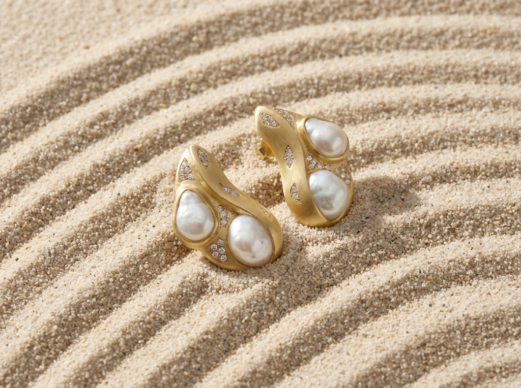
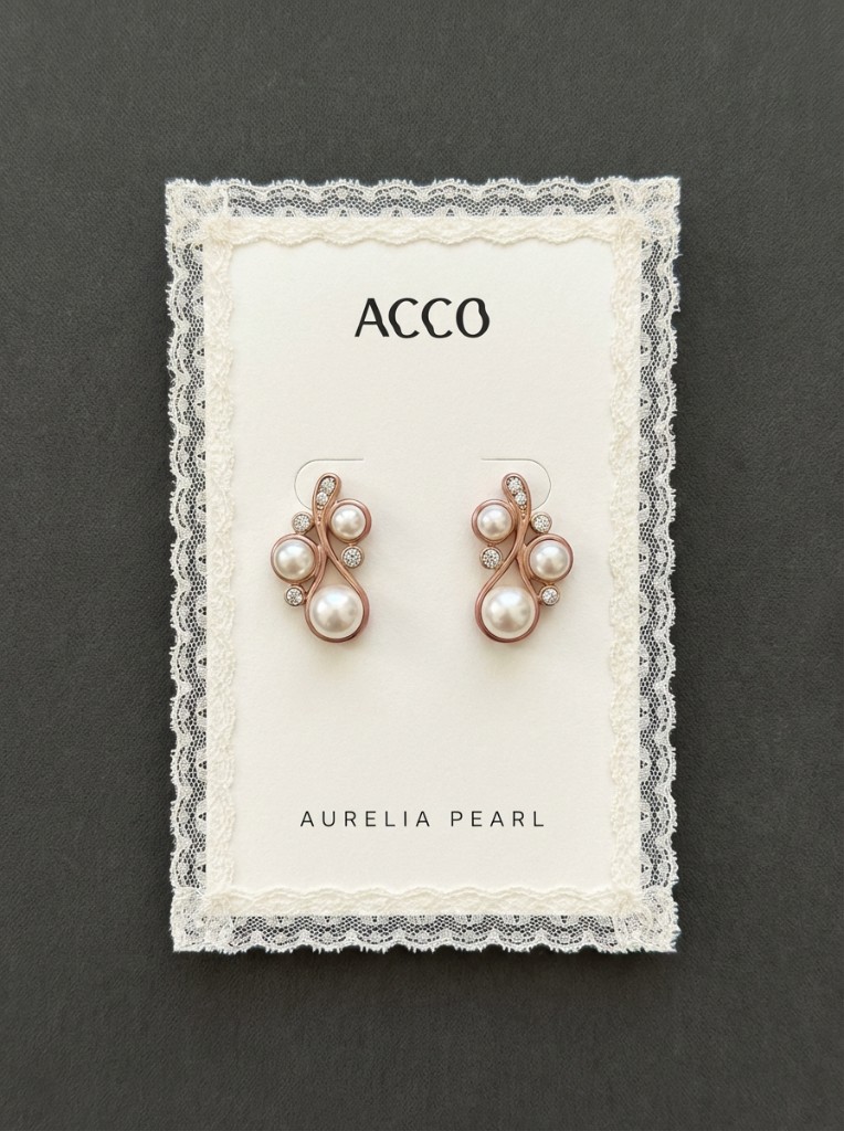
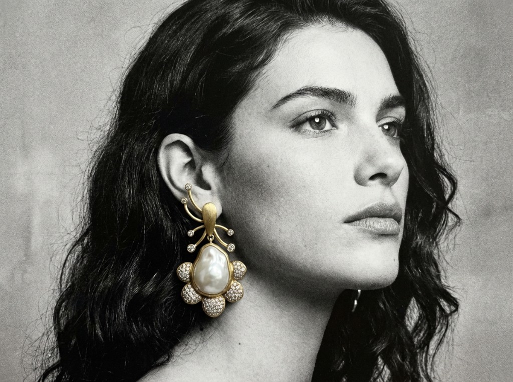
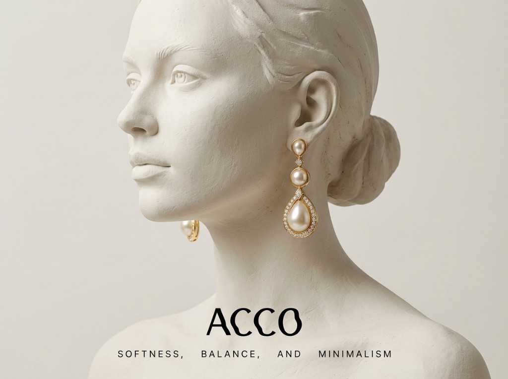
ACCO celebrates the timeless trio: lustrous pearls, warm gold, and carefully selected diamonds.
Each piece is handcrafted to honor natural beauty, pearls chosen for their luminous glow, gold that warms the skin, and diamonds that catch the light just right.
- Understated
- Poetic
- Unhurried
- Feminine without softness
- Never salesy
Jewellery for a life already well-lived.

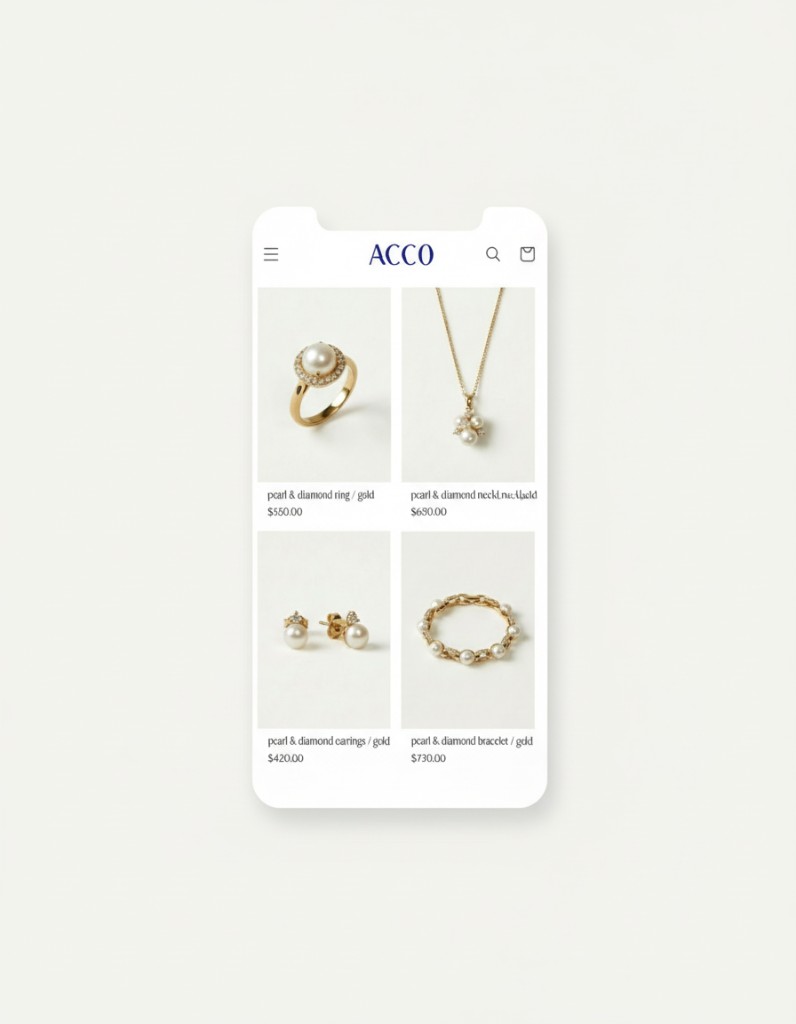
Retail website
Scroll inside the frame to browse the full page sequence.

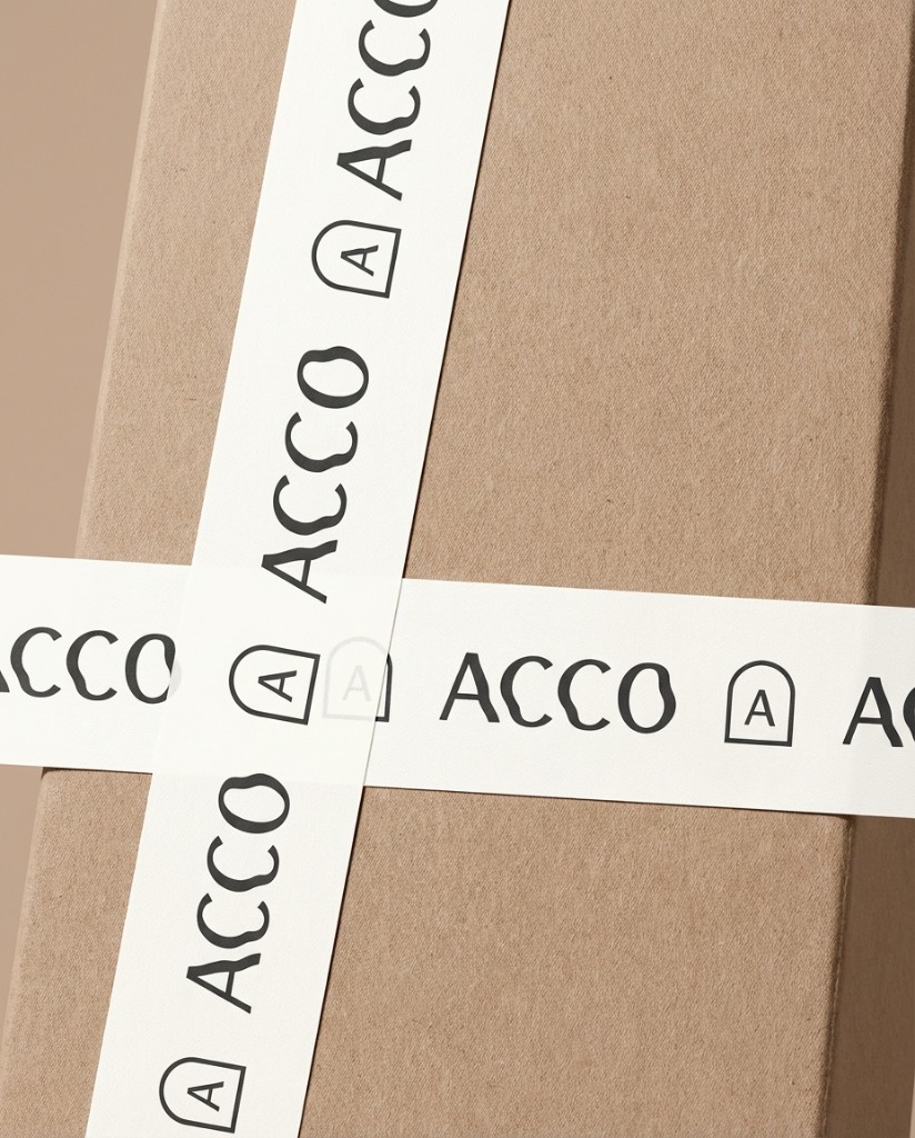
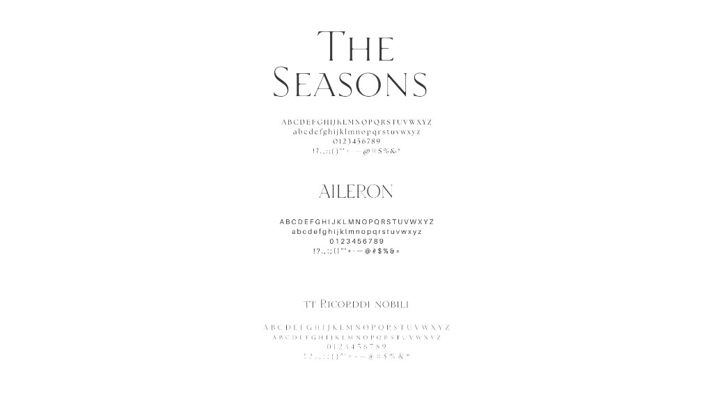

A quiet, confident identity for Acco, where typography and negative space do the talking. We built a flexible system that feels editorial without ever shouting.
Deliverables spanned guidelines, digital layouts, and production-ready assets tuned for both screen and print.